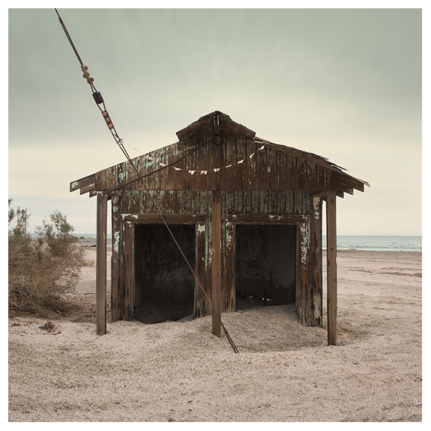
I’ve always been drawn to images that most would consider lonely or desolate. I find them oddly comforting.
You might have noticed me experimenting with different color palettes lately. I’ve been challenging myself to work in color mainly because I’m very comfortable working in black and white, and I want to grow in areas where I’m not as comfortable.
As with any composition element, I believe color should be used purposefully, not haphazardly. Not only do I want the colors to work well together, but also to evoke feeling from the subject.
Several of my recent images have used subtle, but joyful color schemes where I normally would have used no color. I try to use restraint, pulling back the color in some areas to emphasize it in others, rather than just cranking up the saturation. I feel like it transforms these potentially lonely scenes into something more like what I experienced when working in them: peace, comfort, solitude, quietude. I’m still learning a lot about color, but I’m doing my best to use it with intention.

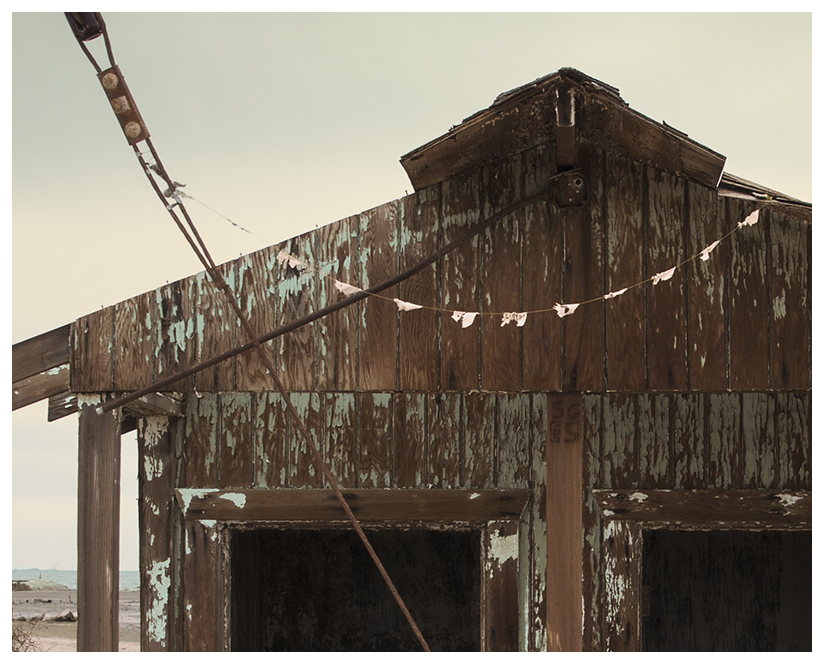
On the center post of the hut are carved the initials:
SG
ES
I enjoy these subtle little details. But, unfortunately, those of you who primarily view my photographs as low-resolution images on the web usually miss out on these things. For those of you who are unable to see my larger high-resolution prints in person on a gallery wall, I hope you’ve enjoyed the close-up details of my images I’ve recently been including in my posts here.


